Best Data Visualization Tools For 2024
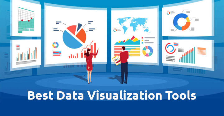
Image source- Google
In the data-driven era, data visualization tools are crucial for businesses to interpret and visualize data effectively. Startups rely heavily on these tools, but selecting the most reliable and useful one can be challenging. This article reviews the best database visualization tools in 2024, focusing on the most useful in the real world and especially important for startups. These tools not only create stunning visualizations but also help analyze complex databases and communicate insights effectively. The article reviews major visualization tools and highlights the most useful in the real world for startups in 2024.
What Is The Meaning Of Data Visualization Tools:
Data visualization is a method of representing data in a graphical format, enabling the identification of relationships and patterns that are difficult to discern from raw data. It is also a powerful tool for communicating complex ideas quickly and effectively, even with complex data sets, by highlighting the relationships between variables and making sense of seemingly unnoticed information.
Why Nowadays Data Visualization Tools Are Important To Us:
Visualizations are a powerful tool for conveying data stories, simplifying communication, and engaging with audiences. They are effective for presenting to colleagues, clients, or stakeholders, offering several key advantages.
Increased Data Perception:
Humans process visual information faster than text or numbers, making charts, graphs, and maps useful for understanding patterns, trends, and relationships at a glance.
Improved Making Choices:
Visualizations help identify trends and insights, enabling informed and data-driven decisions by identifying outliers, correlations, and anomalies that may impact the decision-making process.
More Data Research:
Data visualization tools offer interactive features for in-depth data exploration. They allow users to drill down, filter, and change visualizations on the fly, enhancing their understanding of underlying information.
Efficient Interactions:
Visual representations aid in conveying complex data to diverse audiences, enabling easier insights, storytelling, and audience engagement, whether presenting to colleagues, clients, or stakeholders.
Speed And Cost Reductions:
Automated data visualization tools save time and resources by providing intuitive interfaces and pre-built templates for the quick and efficient creation of professional-looking visualizations.
So, all these factors affect any small—or large-scale business or startup in several ways. Data visualization tools are the most trusted for startups especially.
The Best Data Visualization Tools For 2024:
Data visualization tools are essential for businesses as they simplify complex data, making it easier to understand client trends, market conditions, and strategies for success. So, to achieve success in your running business or for your startups, go through the best data visualization tools for 2024:
Thoughtspot:

Image source- Google
ThoughtSpot is an AI-driven analytics platform that offers real-time data comprehension and data-driven decision-making. It allows users to discover insights using everyday language queries easily and features Liveboards for seamless sharing of insights. ThoughtSpot is designed for everyone, from C-suite to frontline teams, to search for answers to business questions, get immediate insights, and make fact-driven decisions. The platform is simple yet powerful enough to scale with complex data environments.
The Features Of Thoughtspot:
Liveboards is a dynamic data visualization tool that allows users to create interactive dashboards that update in real time with new data. It also offers data integration, allowing users to connect various sources into a single dashboard. Liveboards is mobile-friendly, making it easy to access data and insights while on the go. It also uses AI-powered search to understand data trends and patterns, enabling users to extract valuable insights from their data.
Looker:

Image source- Google
Looker is a business intelligence and data visualization platform that allows users to analyze and share data through a web-based interface. Acquired by Google for $2.6 billion in 2020, it is now part of Google Cloud. The platform integrates with database software and provides a drag-and-drop dashboard with features like date range overlays and data slicers. It is the simplest data visualization tool for end users.
The Features Of Looker:
Looker is a popular data visualization and BI tool that allows users to create charts, graphs, and reports. It integrates with various platforms like Segment, HubSpot, Salesforce, and BigQuery. It has an API and is used by companies like PayPal, Blue Apron, Airbus, Etsy, and The Home Depot. The platform is simple to use, making it easy for stakeholders to become familiar with. However, it is expensive and suitable for mid and large-sized organizations, costing over $5k+ per year.
Microsoft Power BI:
Image source- Google
Microsoft Power BI is a powerful data visualization tool that allows users to create visually appealing reports and dashboards for data-driven decision-making. It's highly effective in integrating with various data sources, making it easy to consolidate and analyze data across an organization. Its user-friendly interface and seamless integration with other Microsoft applications make it an ideal choice for businesses seeking to leverage their data.
The Features Of Microsoft Power BI:
Power BI offers interactive dashboards and reports with a drag-and-drop interface, default visuals like charts, maps, and graphs, and customizable options through the custom visuals SDK. It provides explanations for change analysis for attribute values and shows results in the visualization context. Power BI tools like Power Query and Power Pivot allow data modeling, relationship definition, and calculated measures using DAX.
Google Data Studio:
Image source- Google
Google Data Studio is a web-based, easy-to-use, free, and reliable data visualization tool. It comes free with the rest of the Google Suite but needs more depth and simplicity. However, it is suitable for simple, straightforward data visualization and is often used by companies starting to analyze their data. Google Data Studio connects seamlessly with Google Analytics, making basic traffic and marketing analytics easier. It is suitable for those looking to start analyzing their data.
The Features Of Google Data Studio:
Data Studio is a robust data visualization tool that offers a dashboard and UI similar to Google Drive. It allows users to search for reports, templates, and data sources and customize visibility. It can analyze data from over 800 data sets across 490 connectors, ensuring data integrity and security. Data Studio's performance-driven in-memory BI Engine integrates with BigQuery data warehouses, allowing live data presentation in one dashboard. Users can customize filters and metrics, explore databases, and collaborate in real time. The tool also provides charts and graphs like Gantt, Radar, and Start Rating.
Qlik Sense:

Image source- Google
Qlik Sense is an advanced analytics platform that enables business users to analyze data. It offers advanced capabilities for on-premise and cloud deployment. It aids in identifying insights, making quick decisions, and managing connections to various data sources. Its unique selling point is its flexibility and ease of embedding.
The Features Of Qlik Sense:
Qlik Sense is a comprehensive data visualization tool that offers interactive insights. It enables users to ask complex questions about their data using AutoML and predictive analytics. The tool also provides real-time data pipeline features, alerts, trigger automation, and monitoring. It supports hybrid deployment from multiple sources, including public, private, and on-premises sites.
Domo:

Image source- Google
Domo is a data visualization solution that aids in data analysis, decision-making, and prediction, supporting all personas. Originally designed for analysts, it now offers functionalities and support to designers and developers.
The Features Of Domo:
Domo is a data visualization tool that provides chart types, custom maps, and a low-code environment for creating dashboards and reports without technical expertise. It supports Domo-hosted models from Jupyter Workspaces and AutoML, as well as independently hosted models like OpenAI and Hugging Face. It offers a drag-and-drop interface for data modeling.
How Will Data Visualization Progress In The Years To Come?
Organizations will increasingly require customization of data views and access, with data visualization tools making it easier to align visualizations with workflows for immediate action. Businesses will benefit from dashboards and intelligent apps for unprecedented customization and data democratization. All running or startup businesses will easily achieve their desired goal.
In conclusion, the best data visualization tool for your startup ultimately depends on your specific needs, technical expertise, and budget constraints. Startups in 2024 can benefit from a user-friendly solution for basic visualizations or a powerful tool to unlock data potential. By utilizing these tools, startups can gain valuable insights, drive informed decision-making, and achieve their business goals in a competitive landscape, thereby laying the foundation for their data visualization journey. So, choose wisely and make your journey more and more successful.


Comments
Post a Comment